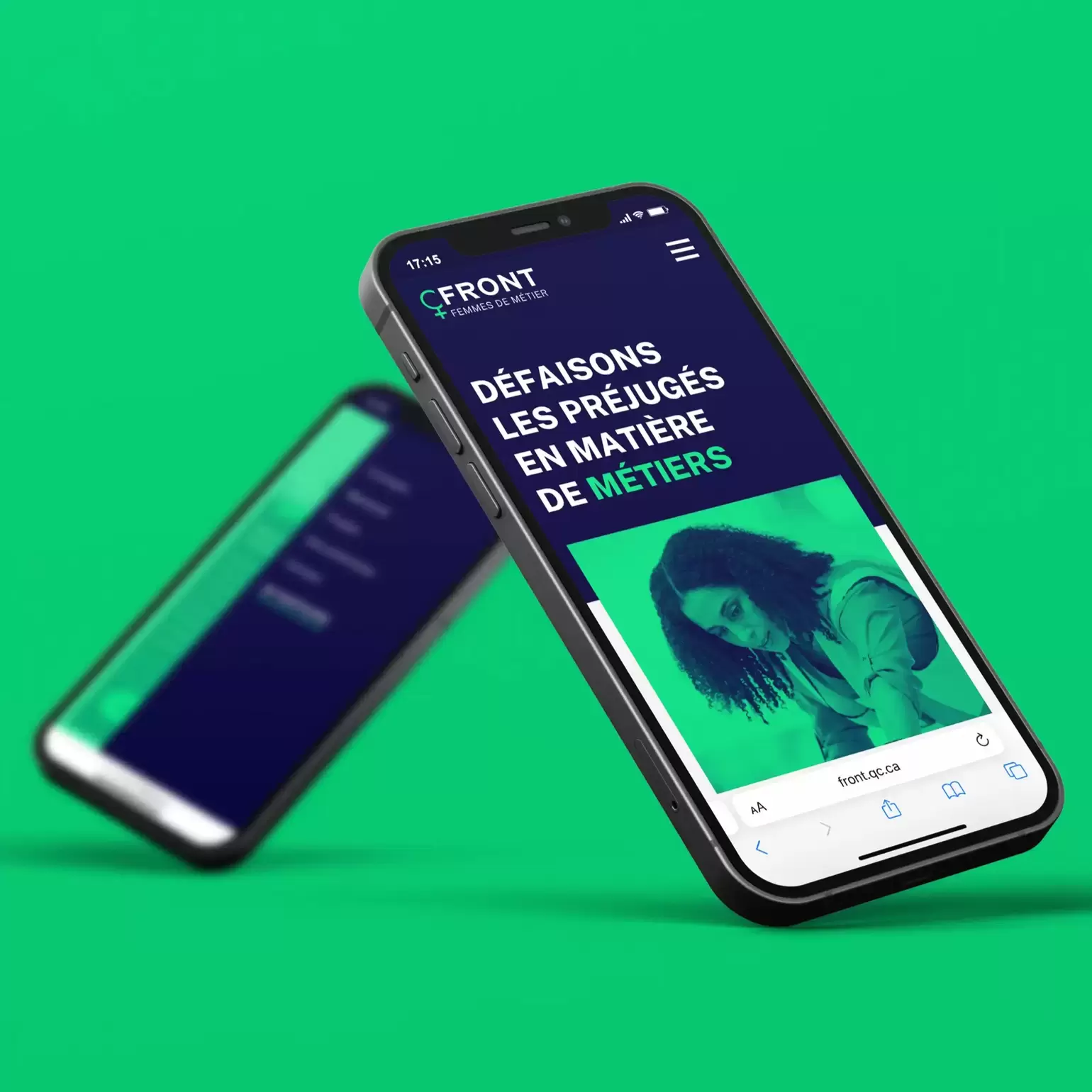
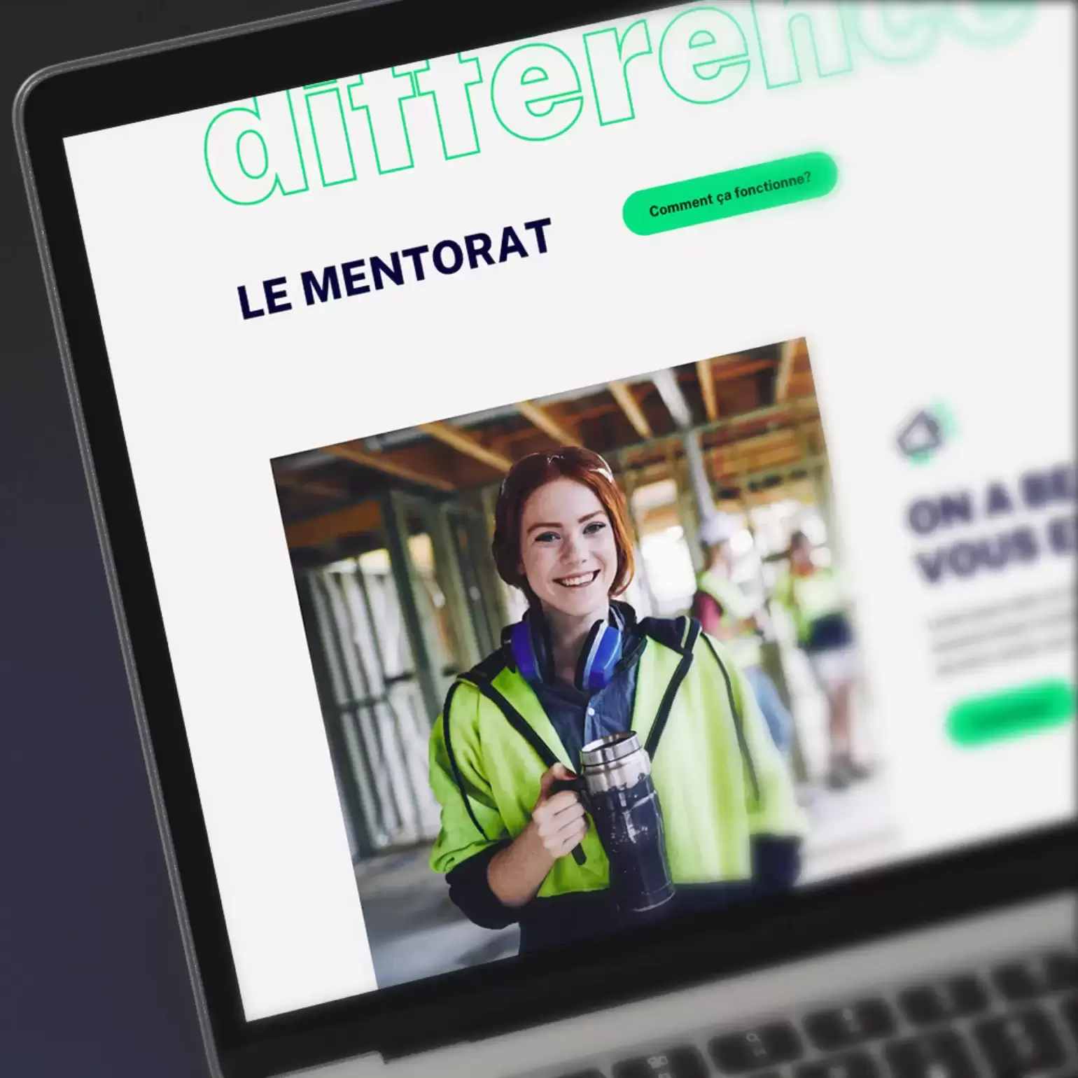
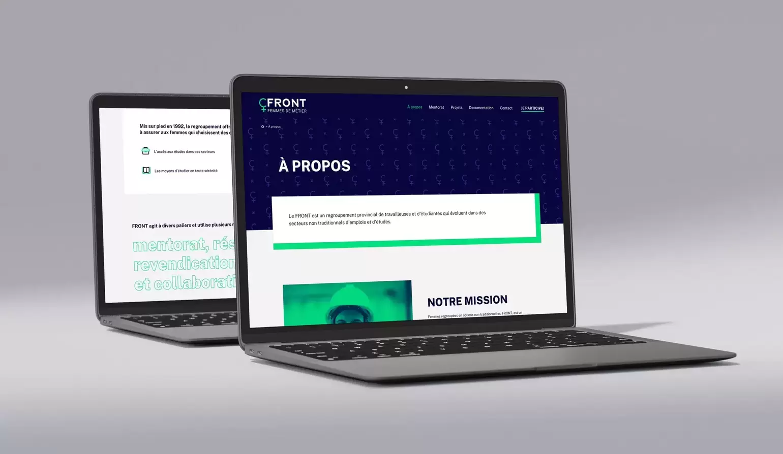
The client
FRONT (Femmes Regroupées en Options non Traditionnelles) is an organization created by women who support their peers, particularly those interested in pursuing non-traditional trades where women represent less than 33% of the workforce.

FRONT (Femmes Regroupées en Options non Traditionnelles) is an organization created by women who support their peers, particularly those interested in pursuing non-traditional trades where women represent less than 33% of the workforce.

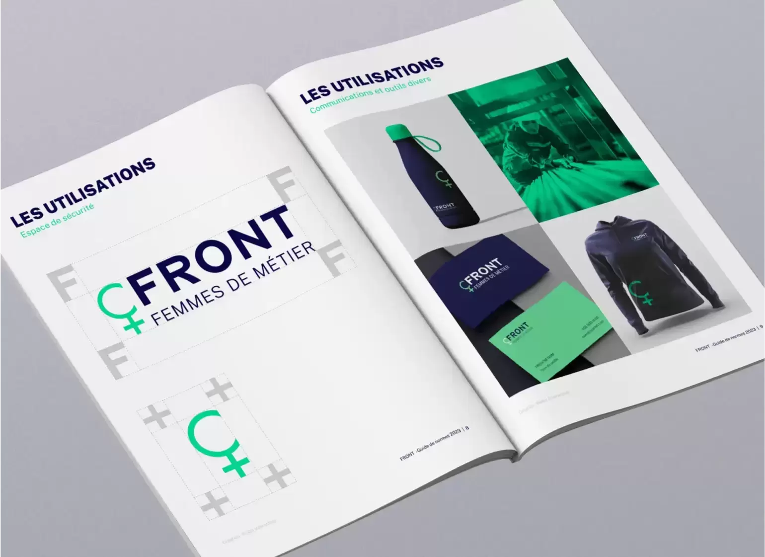
We quickly realized that to elevate FRONT's brand image to be recognizable, distinctive, and powerful; the organization first needed to revamp its branding.
Although this was not initially part of their request, the clients realized its importance for achieving their goals.
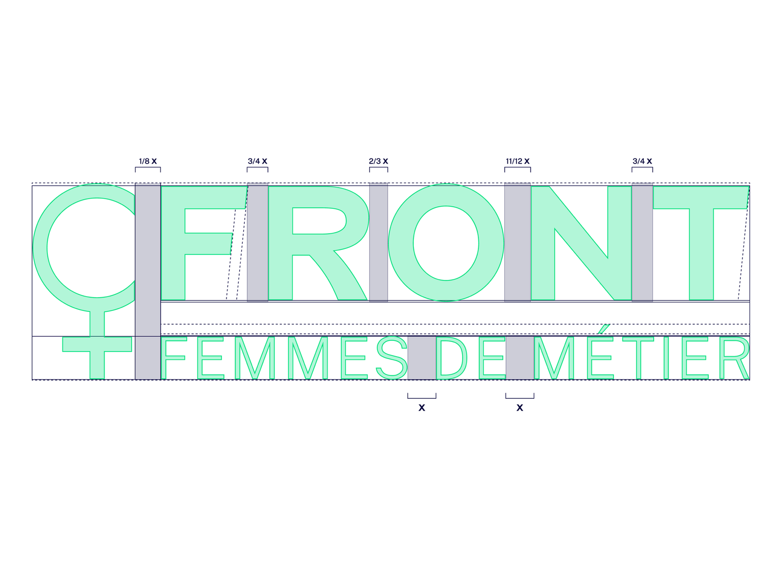
Collaborative modernization with the clients. Their idea of adding the slogan "femmes de métier" (women in trades) reinforced the brand.
Simple and robust, creating a powerful image representing various non-traditional options.
Comprises a symbolic graphic element and typography with dynamic letter angles.
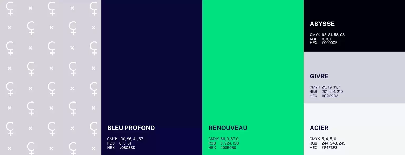
Turquoise replaced the aggressive red, evoking support and renewal. Deep blue instead of black adds a technological and industrial aspect to the visual identity.
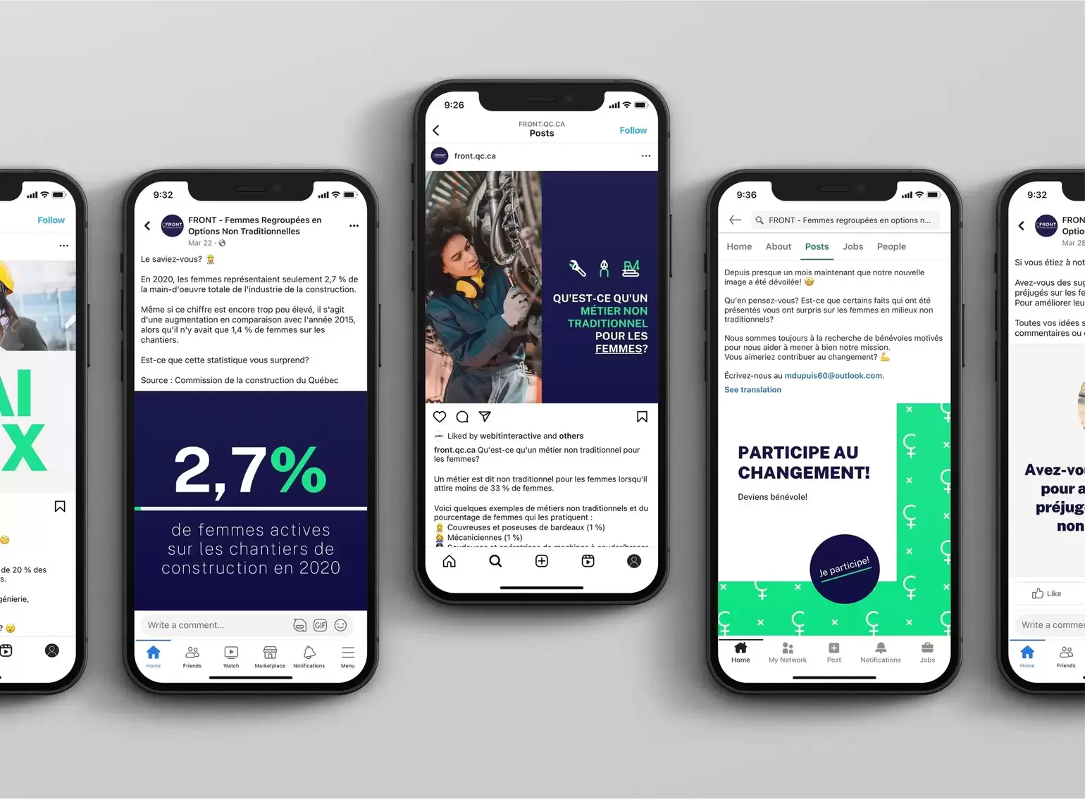
FRONT's mission of supporting, guiding, informing, and facilitating access to education for women in non-traditional trades has a high potential for attracting new customers. However, the organization is still relatively unknown.
Our contribution aimed to focus on what is genuinely significant for FRONT to further its mission, including:
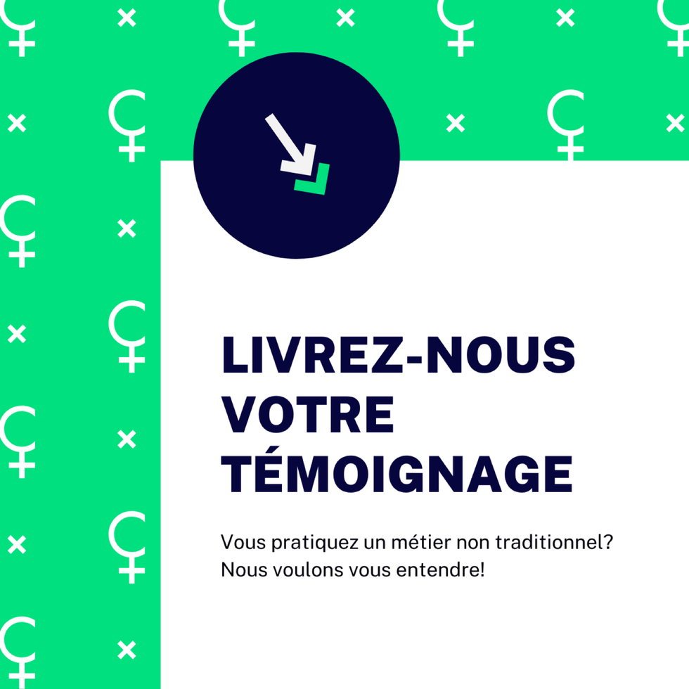
FRONT's refreshed branding now showcases a powerful, relevant, and cohesive image, cementing the organization's credibility. Our efficient social media management has enabled us to gather genuine testimonials naturally.
