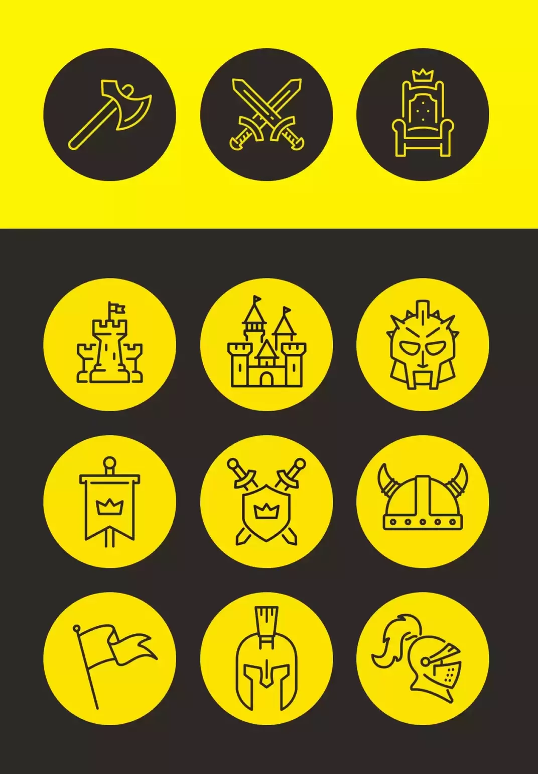
From the logo through the slogan for a brand image that leaves its mark.

1 Duel branding

The Duel universe

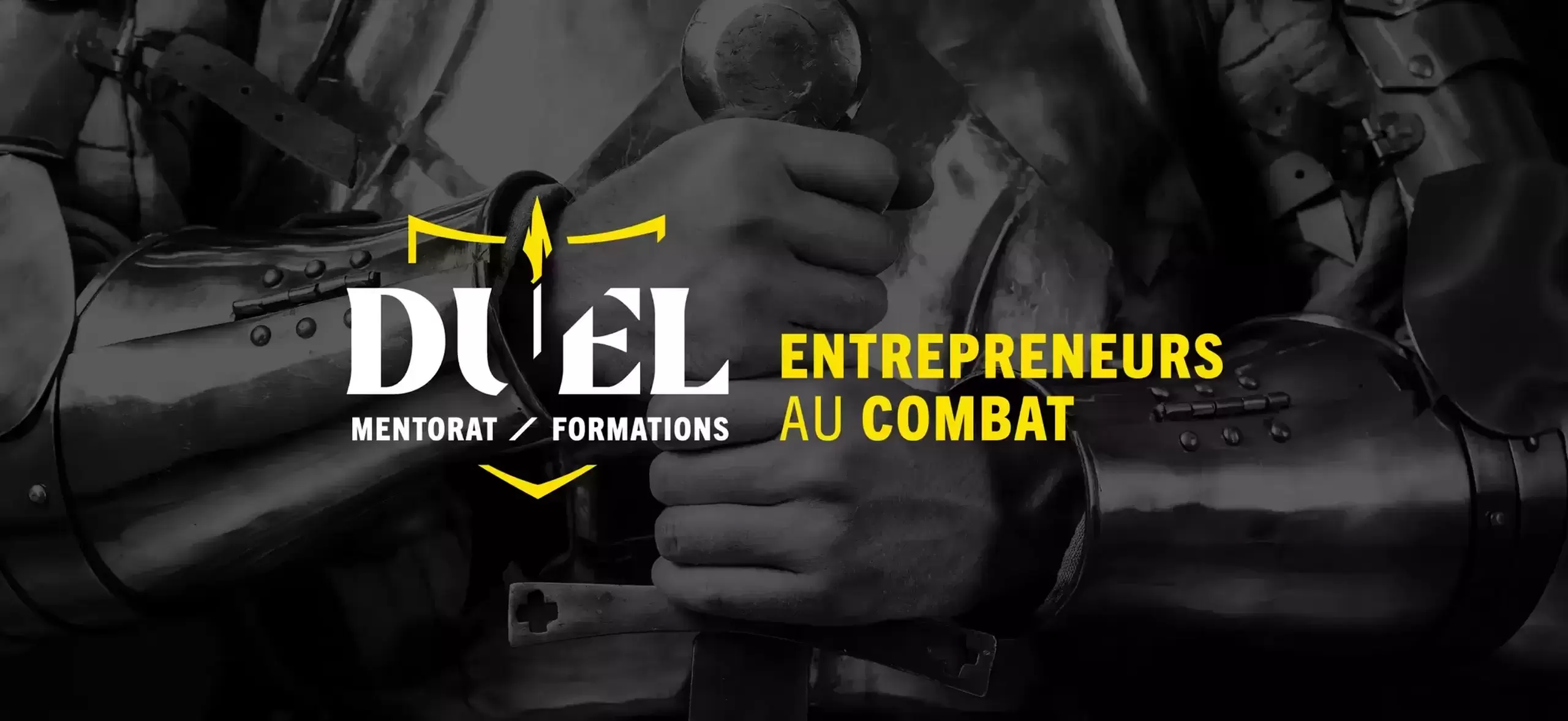
"Duel" is much more than a simple training and support platform for entrepreneurs. It specializes in business coaching and education, focused on results.

Their approach is designed for true entrepreneurial warriors who will stop at nothing to succeed. They target go-getters and warriors for success who have a thirst for surpassing themselves and are ready to give everything to achieve their most ambitious professional goals.

Our support

For Duel, we didn't stop at just creating a brand image. We are committed to making the company's image a dominant force in the market.

By collaborating with us, Duel benefited from complete and personalized support to forge an identity that truly reflects the grandeur of its entrepreneurial vision.

From the impactful name and slogan to the imposing logo and overall branding, we put our expertise and creativity to work for their success.

We firmly believe that branding is more than just a matter of aesthetics; it's a powerful tool for inspiring trust, attracting attention and driving engagement.

3 Duel identite marque manifeste

A 360 branding mandate

We created the complete brand identity and environment.

We had to undertake in-depth research highlighting Duel's strengths to do this. Armed with astute questions, we explored their core values, their approach, their expectations, their mission and, of course, their vision.

  • Perfect Name Definition
  • Creating a catchy slogan
  • Brand positioning
  • Tone accuracy
  • Development of iconography, graphic charter and standards guide
  • Video creation
  • The log
5 Duel ton redactionnel
DUEL - Entrepreneurs au combat (2023)
7 Duel branding symbole
8 Duel branding iconographie

A result of using the Webit key

The branding was created to embody Duel's exceptional inner strength, the robustness of its expertise and its direct, motivating approach.

Name: Duel (representing duality with oneself)

Tagline: Entrepreneur in battle

Logo: The shield to defend yourself, resist, attack and win.

The tone: With a bold but welcoming approach, the tone adopted had to be accessible, using familiarity to establish proximity with each individual.

We have carefully selected colours that best reflect Duel's strong personality. Opting for a combination that moves away from conventional corporate standards, we have chosen:

Yellow: symbol of dynamism, optimism, intelligence and abundance.
Black:
evoking power, strength, ability, professionalism, power, wisdom and humility.

9 Duel guide marque couverture
10 Duel guide marque
11 Duel logo beachflag

Have a project in mind? Let's make it happen!

You’re one click away from driving your growth. Together, we’ll create the integrated marketing strategy that fits your reality.

Contact us
Start your project